12 Data Quality Metrics That ACTUALLY Matter

Table of Contents
Data teams work hard to collect, track, and use data. But so often, we have no idea if the data we’re leveraging is really accurate. In fact, many companies will have excellent data pipelines, but terrible data. And if the data’s bad, it really doesn’t matter how good the pipelines are.
One of our customers posed this question related to data quality metrics:
I would like to set up an OKR for ourselves [the data team] around data availability. I’d like to establish a single data quality KPI that would summarize availability, freshness, quality. What’s the best way to do this?
I can’t tell you how much joy this request brought me. By measuring data downtime, this simple data quality KPI will help you determine the reliability of your data, giving you the confidence necessary to use it or lose it.
Table of Contents
What are data quality metrics?
Data quality metrics are the measurements data teams use to monitor and communicate the health of their data and pipelines for stakeholders. When chosen carefully—and managed properly—good data quality metrics will not only help you improve the reliability of your data assets, but it can also contribute to data trust across your organization.
Why do data quality metrics matter?
If you’re in data, you’re either working on a data quality project or you just wrapped one up. It’s just the law of bad data — there’s always more of it. By measuring data health with data quality metrics, we can understand the overall health of our pipelines, how are data quality projects are performing, and where we still have room for improvement.
Traditional methods of measuring data quality metrics are often time and resource-intensive, spanning several variables, from accuracy (a no-brainer) and completeness, to validity and timeliness (in data, there’s no such thing as being fashionably late). But the good news is there’s a better way to approach data quality metrics.
Data downtime — periods of time when your data is partial, erroneous, missing, or otherwise inaccurate — is an important data quality metric for any company striving to be data-driven.

Examples of data quality metrics
Data can go bad for all kinds of reasons. The right data quality metrics will account for the plurality of potential causes and issues related to the health of both your data and your pipelines, to give your data team a holistic understanding of what’s working and where to focus next.
Some examples include data quality metrics or KPIs that cover issues in your data, system, and code—which will likely require a modern approach to data quality management as well—as well as the processes that surround incident management.
Metrics that cover the health and performance of queries, numbers and kinds of incidents detected, and team performance are all critical metrics to measure data quality.
The most important data quality metrics
Overall, data downtime is a function of the following data quality metrics:
- Number of data incidents (N) — This factor is not always in your control given that you rely on data sources “external” to your team, but it’s certainly a driver of data uptime.
- Time-to-detection (TTD) — In the event of an incident, how quickly are you alerted? In extreme cases, this quantity can be measured in months if you don’t have the proper methods for detection in place. Silent errors made by bad data can result in costly decisions, with repercussions for both your company and your customers.
- Time-to-resolution (TTR) — Following a known incident, how quickly were you able to resolve it?
By this method, a data incident refers to a case where a data product (e.g., a Looker report) is “incorrect,” which could be a result of a number of root causes, including:
- All/parts of the data are not sufficiently up-to-date
- All/parts of the data are missing/duplicated
- Certain fields are missing/incorrect
Here are some examples of things that are not a data incident:
- A planned schema change that does not “break” any downstream data
- A table that stops updating as a result of an intentional change to the data system (deprecation)
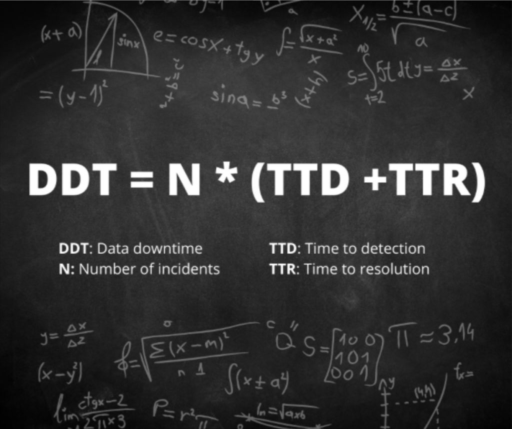
Bringing this all together, I’d propose the right formula for data downtime is:
12 data quality metrics every data team should track
Of course, if we hold that data downtime is our north star data quality KPI, then all of the data points that make up the formula are important as well. For example:
1. Data downtime
Data downtime is the total time that data products deliver incorrect information to their users. This includes everything from executive dashboards to customer-facing applications. Unlike traditional uptime measurements that focus on whether applications are running, data downtime captures something more important. It shows whether the information itself can be trusted.
Data downtime is built from three key components that work together to create the complete picture.
Number of data incidents (N) measures how many problems occur across your data pipelines. This factor isn’t always under your control because teams often rely on data sources managed by other departments or external vendors. However, it remains a major driver of overall data reliability.
Time-to-detection (TTD) tracks how quickly teams discover problems when they happen. In the worst cases, this can be measured in months if proper detection methods aren’t in place. Silent errors from bad data can lead to costly business decisions that hurt both companies and their customers.
Time-to-resolution (TTR) measures how quickly teams fix problems once they know about them. The faster the fix, the less damage the bad data can cause.
Understanding what counts as a data incident is crucial for accurate measurement. A data incident happens when a data product like a Looker report shows incorrect information. This can result from several root causes. All or parts of the data might not be current enough for decision-making. Data could be missing or duplicated. Certain fields might contain wrong or missing information.
Equally important is understanding what doesn’t count as a data incident. Planned schema changes that don’t break downstream data represent normal data management rather than quality failures. The same applies when tables stop updating because of intentional changes like deprecating old data sources
Bringing this all together, I’d propose the right formula for data downtime is:
Data downtime is an effective data quality metric. It is measured by the number of data incidents multiplied by the average time to detection plus the average time to resolution.
This formula shows why data downtime has become so valuable as a measurement tool. It doesn’t just count problems. It weighs them by their actual business impact. A data incident that goes undetected for weeks carries much more weight than one caught and resolved within hours.
Consider this example. A marketing team’s conversion tracking dashboard begins showing inflated numbers because of a data pipeline error that duplicates certain customer actions. If this error goes undetected for two weeks during a major campaign, the resulting decisions could cost millions. The same error caught within two hours might require only a simple correction and a brief explanation to stakeholders.
2. Total number of incidents (N)
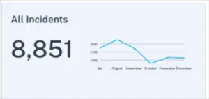
The raw count of data incidents across all pipelines serves as a fundamental health check for organizational data quality. However, this metric requires careful interpretation. A sudden spike in incidents might indicate serious problems that need immediate attention. Or it could signal that improved data quality monitoring tools are finally catching issues that previously went undetected.
This creates what data quality experts call the “maturity curve effect.” Organizations just starting their data quality programs often see incident counts rise initially. This doesn’t mean data quality is getting worse. Instead, they’re finally measuring problems that already existed but were invisible before. Companies with mature programs might see low incident counts that could mask either excellent data health or inadequate monitoring coverage.
Your organization’s data quality maturity level directly affects how to interpret incident numbers. Early-stage teams might celebrate dropping from 200 to 100 incidents per month, while advanced teams might investigate any increase from 10 to 15 incidents as a potential warning sign.
The key lies in tracking incident trends over time while accounting for changes in monitoring coverage and data volume. A well-monitored data organization typically sees incident rates decrease as processes improve, even as the total amount of data grows. Teams should also break down incident counts by severity level, data domain, and root cause to identify patterns that point toward deeper issues.
Context behind incident numbers proves just as important as the numbers themselves. A team managing 10,000 tables with 50 incidents per month operates very differently from a team managing 100 tables with the same incident rate. The first scenario suggests strong overall reliability, while the second indicates significant quality challenges.
3. Table uptime
Table uptime measures the percentage of data tables operating without incidents over a given period. This metric provides crucial context for raw incident counts. A data environment with 1,000 incidents might seem chaotic until you learn it involves 100,000 tables, resulting in 99% table uptime.
This metric works particularly well when filtered by incident type. Teams can track uptime specifically for freshness violations, schema changes, or volume anomalies to get a clearer picture of where their data infrastructure performs well and where it struggles. Custom freshness rules allow organizations to set different expectations for different types of data, making uptime measurements more meaningful.
Table uptime also serves as an excellent communication tool for stakeholders who might not grasp the technical details of data incidents but can easily interpret uptime percentages. A monthly report showing 98.5% table uptime tells a clear story about data reliability without requiring deep technical knowledge.
The metric becomes especially valuable when tracked over time and compared across different data domains. Marketing tables might consistently achieve 99% uptime while financial reporting tables struggle to maintain 95%. These patterns help data teams prioritize their improvement efforts and allocate resources where they’ll have the biggest impact.
Most organizations aim for table uptime above 95%, though the specific target depends on business requirements and data quality maturity. Customer-facing applications typically demand higher uptime than internal analytics workloads.
4. Time to response (detection)
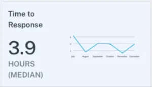
Time to response measures the median time from when an incident gets created until a member of the data engineering team updates it with a status. This status might be “investigating,” but could also be “expected,” “no action needed,” or “false positive.” This metric captures how quickly teams acknowledge and begin addressing data quality issues.
Response time differs from detection time in an important way. Detection time measures how long it takes for monitoring tools to identify a problem. Response time measures how long it takes for humans to act on that detection. A monitoring tool might catch a data freshness issue within minutes, but if the team doesn’t respond for hours or days, the business impact continues to grow.
Fast response times indicate several positive organizational factors. Teams with good response times typically have clear escalation procedures, adequate staffing levels, and strong communication channels between monitoring tools and on-call personnel. They also tend to have well-defined incident classification processes that help engineers quickly categorize and prioritize new issues. These teams often use automated alerting that routes different types of incidents to the appropriate specialists, reducing the time spent figuring out who should handle each problem.
Slow response times often reveal operational challenges beyond just technical ones. Alert fatigue from too many false positives can cause teams to ignore or delay responses to legitimate issues. Unclear ownership of data assets can leave incidents unassigned while team members assume someone else will handle them. Poor integration between monitoring tools and communication platforms can mean alerts get lost in email inboxes or chat channels. The median response time provides a more accurate picture than average response time because it isn’t skewed by occasional incidents that sit unaddressed for days or weeks. Most high-performing data teams aim for median response times under four hours during business hours, though this varies significantly based on the organization’s data quality maturity and operational structure.
5. Time to fixed (resolution)
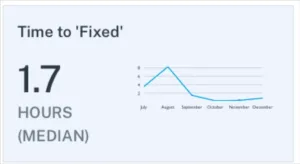
Time to fixed measures the median time from when an incident receives its first status update until the status changes to “fixed.” This metric captures the actual work required to resolve data quality problems once teams begin investigating them. Unlike response time, which focuses on acknowledgment, resolution time reflects the technical complexity and resource requirements of different types of data incidents.
Resolution times vary dramatically based on the nature of the problem. Simple issues like restarting a failed pipeline job might resolve within minutes. Complex problems involving corrupted historical data or broken upstream dependencies can take days or weeks to fully address. Teams often find that most incidents resolve quickly while a small number account for the majority of their total resolution time.
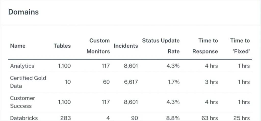
It’s important to measure the above data quality metrics by domain to understand the areas where additional optimization may be needed.
The top teams track resolution time by incident category to identify patterns in their data infrastructure. Frequent long resolution times for schema change incidents might indicate insufficient testing procedures. Consistently slow fixes for data freshness issues could reveal capacity problems in processing infrastructure. This categorization helps teams invest in preventive measures that reduce both the frequency and complexity of future incidents.
Several factors influence resolution speed aside from technical complexity. Teams with detailed documentation and runbooks can resolve familiar issues much faster than those working from scratch each time. Good relationships with upstream data providers enable quicker coordination when problems originate outside the team’s direct control. Automated rollback procedures can dramatically reduce resolution times for deployment-related incidents. Most mature data teams aim for median resolution times under 24 hours, though this target should account for the specific mix of incident types the organization typically encounters.
6. Importance score
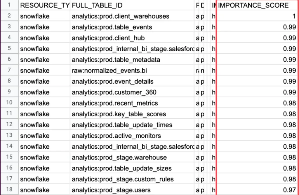
Importance score measures how critical each data table is to business operations by tracking the number of read and write operations plus downstream consumption at the business intelligence level. This metric helps data engineers prioritize their incident response efforts by focusing first on problems that affect the most important business processes. Risk comes from combining frequency and severity, and you can’t assess the severity of a data incident without knowing how important the affected table is to daily operations. The metric typically combines several usage indicators to create a comprehensive view of table importance, including direct query frequency, downstream dependencies, user diversity, and revenue impact.
Organizations often discover surprising patterns when they first implement importance scoring. Tables that seem critical to engineers might have minimal business usage, while seemingly minor lookup tables power dozens of customer-facing reports. Marketing attribution tables might rank higher than expected because they influence million-dollar advertising decisions where data accuracy directly determines campaign budget allocation and strategic direction. Customer service tables might show high importance scores due to frequent access during peak support hours, where accuracy problems can immediately impact customer satisfaction and resolution times.
The importance score becomes especially valuable during incident triage when multiple problems compete for attention. A minor data freshness issue affecting a high-importance customer billing table deserves immediate attention, while a significant schema problem on a rarely-used experimental dataset can wait until normal business hours. This scoring also indicates where teams should invest in advanced monitoring, custom data tests, or formal data contracts to prevent future incidents.
7. Table health
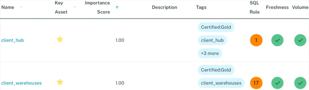
Table health measures the frequency component of data risk by tracking the number of incidents each table has experienced over a specific time period. While importance score represents the severity side of the risk equation, table health provides the frequency data needed to calculate overall risk exposure. A table that experiences frequent incidents poses a higher risk to business operations than one that rarely encounters problems, regardless of how those incidents get resolved.
This metric helps teams identify their most problematic data assets and patterns in data reliability. Some tables might show consistently poor health due to dependencies on unreliable upstream sources or fragile data ingestion processes that fail when external feeds change formats or experience delays. Others might experience seasonal patterns where health degrades during high-volume periods like end-of-quarter reporting or holiday shopping seasons. Technical debt in older tables often manifests as gradually declining health scores over time.
Table health scores work best when combined with importance scores to create a comprehensive risk assessment. A table with poor health but low importance might warrant process improvements during routine maintenance windows. However, a table with both poor health and high importance represents a critical risk that demands immediate architectural review and investment in better monitoring, testing, and error handling.Teams typically track table health using rolling windows of 30, 60, or 90 days to smooth out temporary fluctuations while capturing meaningful trends. The metric helps prioritize technical debt reduction efforts by identifying which tables would benefit most from refactoring, improved data contracts with upstream providers, or migration to more reliable infrastructure. Data contracts establish formal agreements about data quality expectations, delivery schedules, and schema change notifications, helping prevent many of the upstream issues that contribute to poor table health scores.
8. Table coverage
Table coverage measures the percentage of production data tables that have monitoring in place for data freshness, data volume, and schema changes. Complete coverage across as many production tables as possible is critical for ensuring data reliability because data infrastructures are highly interconnected. Issues from one unmonitored table often flow downstream into other tables, creating cascading failures that can be difficult to trace back to their original source.
The interconnected nature of modern data architectures means that gaps in monitoring coverage create blind spots where problems can hide and multiply. A single unmonitored lookup table that starts returning incorrect values can corrupt dozens of downstream reports and dashboards. Customer segmentation tables that lose records without detection can cause marketing campaigns to miss their intended audiences. Financial reconciliation processes that depend on unmonitored transaction tables might produce inaccurate results for weeks before anyone notices.
Most data observability platforms should achieve coverage rates at or near 100% for basic monitoring like freshness, volume, and schema changes across production tables. This high coverage rate is possible because these fundamental checks can be automated and applied broadly without requiring custom configuration for each table. Teams that maintain broad baseline coverage can then layer on more sophisticated custom monitoring for their most critical data assets.
The coverage metric helps teams identify monitoring gaps and measure progress as they expand their data quality programs. Organizations often start with coverage on their most important tables and gradually extend monitoring to less critical assets. Tracking coverage over time reveals whether the monitoring program is keeping pace with new data sources and growing infrastructure complexity.
9. Monitors created
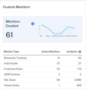
Monitors created tracks the number of custom monitors that data engineering teams build on top of their baseline monitoring coverage. While table coverage ensures broad protection across all production tables through automated freshness, volume, and schema change detection, custom monitors provide targeted surveillance for specific business logic, data quality rules, and complex validation requirements that matter most to individual tables or fields. Custom monitors fill the gaps that automated monitoring cannot address, such as ensuring customer email addresses follow valid formatting rules, verifying financial transaction totals match expected ranges, or checking for suspicious spikes in marketing conversion rates.
The key challenge with custom monitors lies in balancing coverage with alert fatigue. Teams that create too many custom monitors often find themselves overwhelmed by notifications, leading to slower response times and missed critical issues. Most people focus their custom monitoring efforts on their highest-value data assets and most frequent failure modes. They also regularly review and retire monitors that generate false positives or no longer provide useful insights.
This metric becomes particularly valuable when broken down by monitor type and effectiveness. Teams should track how many incidents each custom monitor type generates to identify which monitoring approaches provide the best return on investment. Monitors that never trigger might indicate over-cautious thresholds or stable data that doesn’t require custom surveillance. Monitors that trigger frequently but rarely indicate real problems suggest the need for threshold adjustments or different monitoring approaches.
10. Number of unused tables and dashboards
The number of unused tables and dashboards measures data sprawl by identifying assets that no longer serve active business purposes. It takes courage to deprecate tables and dashboards, and because leaving them in place seems easier than proper cleanup, unused data assets accumulate quickly over time. This accumulation creates several hidden problems that can undermine data quality and operational efficiency across the organization.
Unused data assets make it harder for users to find the information they actually need. When searching for customer data, analysts might encounter five different customer tables with similar names but different schemas, creation dates, and data quality levels. Without clear guidance about which table represents the current source of truth, stakeholders often choose incorrectly or spend valuable time investigating differences. Worse, some users might inadvertently rely on deprecated tables or dashboards, creating multiple conflicting versions of business metrics.
The cleanup process requires careful coordination between data teams and business stakeholders. Teams should track usage patterns over time to identify truly unused assets rather than those with seasonal or periodic access patterns. Financial reporting dashboards might see heavy usage only during month-end cycles, while marketing tables could spike during campaign periods. Well-planned deprecation programs establish clear communication processes, grace periods for stakeholder feedback, and rollback procedures if retired assets turn out to be more important than initially recognized.
This data quality metric serves as both a measure of data governance maturity and a leading indicator of future operational challenges. Organizations with high numbers of unused assets often struggle with data discovery, inconsistent business definitions, and duplicated analytical work. Regular cleanup efforts not only improve the immediate user experience but also reduce infrastructure costs and maintenance overhead for data engineering teams.
11. Deteriorating queries
Deteriorating queries tracks queries that show consistent increases in execution runtime over the past 30 days. This metric serves as an early warning for performance problems that could eventually become failed queries and data incidents. Query performance typically degrades gradually rather than suddenly, making it possible to catch and address issues before they cause user-facing problems or pipeline failures. Several factors can cause query performance to deteriorate over time, including data volume growth, schema changes that eliminate useful indexes, changes to upstream data sources that alter value distributions, lack of regular data cleaning that allows duplicate or invalid records to accumulate, and infrastructure changes like resource constraints or competing workloads.
The value of tracking deteriorating queries lies in proactive intervention rather than reactive firefighting. A report that takes five minutes to load today but took two minutes last month represents a manageable optimization opportunity, while the same report that eventually times out after 30 minutes becomes an urgent incident that disrupts business operations. The best monitoring approaches focus on queries that matter to business operations, such as mission-critical dashboards, customer-facing applications, and frequently-used analytical workloads. Teams should prioritize queries with the steepest degradation rates, as these often indicate underlying issues that could affect multiple related queries or data processes.
12. Status update rate
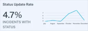
It’s not enough to simply detect data quality incidents. They also need to be managed. A low incident response rate can indicate alert fatigue or even an operational deficiency. Either way, low status update rates suggest that your data team may want to take a second look at your alerting strategy, your internal culture surrounding data quality, or both.
The better your team is at updating the status of incidents, the better your incident response will be.
Focusing on the data quality metrics that matter
Tracking key data quality metrics is the first step in understanding data quality, and from there, ensuring data reliability. With fancy algorithms and data quality KPIs flying all over the place, it’s easy to overcomplicate how to measure data quality.
Sometimes it’s best to focus on what matters. But to do that, you need the systems and processes in place to measure (ideally in a dashboard) the many data metrics that comprise your overall data health.
If you want to learn more, reach out to Barr Moses. Or book a time to speak with us below.
Our promise: we will show you the product.


